L Schroeder
This Pin-Hole photograph was taken from the football field at our high school looking to the stadium. It's my favorite work that I've done so far because I like the way all the colors turned out and how you can compare how the stadium looks in different ways. To edit this photograph I used the brush tool and selected the different colors then changed the opacity to 55%.
In collaboration with other schools around the country Spain Park High School has started a blog to showcase student work from the Digital Photography classes. Please feel free to leave constructive comments and remember to include both your name and school.
March 25, 2011
Line Collage
A Buchanan
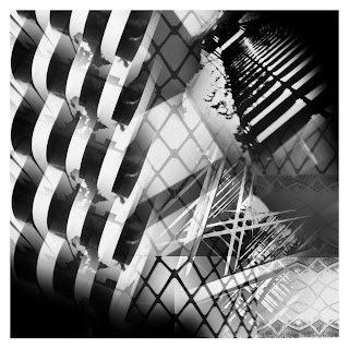
This image is the end result of the pinhole line collage we made in class. It includes photos taken by several people around all parts of the school. I thought the end result turned out to be an interesting contrast between all the lines. The edits I used were all pretty basic, mostly cropping and overlapping images, and bumping the contrast to make the blacks and grays pop a little more.
Going in Circles
E Cowart
I made this for the Pinhole Collage at the end of the first semester. This is created from about twenty different pinhole pictures taken by First Period. This is my favorite image because I have put several hours into making it. Even though I did not take the pinhole pictures, I am proud that I was able to add my own flair to them and make the pictures my own. I have edited it (added a color scheme, enhanced the colors, changed certain pinwheels etc.) over the past few weeks. Each pinwheel consists of one pinhole picture. Each pinhole picture was edited down to the subject, then the opacity was reduced to 7%, and the image rotate 57 times at 7.6 degrees. Once I was happy with the composition, I used original gradients to color the grayscale pinwheels.
“Get Well Soon, Mr. Myers”
A Fields
A collage of images taken in the studio. I like this one since the photographs were just of people, and I went back and added the letters as if they were holding them. I added individual text letters, added a layer mask to make it look like they were holding the letters, and repositioned them as best as I could.
March 24, 2011
Railroad Park
M Maxwell
This photo was taken at Railroad Park in downtown Birmingham, one of my favorite places. I love this picture because I took it with my fisheye lens and I love the sun flare. I bumped the saturation of the photo just a tad.
Its Time to Party
M McGuffie
I compiled all of the individual people, and i copied it three more times rotated on a center point. I changed the hue of each of the four sections. And decorated it with different brushes.
Chameleon
A Hval
This photo was taken in my bathroom. I put one some crazy eye makeup and lipstick, put my hair up, and stood against my shower curtain and took pictures of myself until I found an aesthetically pleasing one. Since the shower curtain was white, I blended into it pretty well, so my face sort of came into the background when I increased the brightness. Along with increasing the brightness, I also increased the saturation and made just the eyes colored. Everything but the eyes and eyebrows is black and white. I also edited out some sides of my face so that they would blend better into the background.
School Grounds
T Morgan
This was a collage of pinhole photos taken by the class around Spain Park High School at random places. This is my favorite because there are a lot of lines leading to different places and I like the random objects in the collage. I used Photoshop to put all the pinhole photos on there and the mask tool to make the objects blend in more along with changing the opacity of some of the objects to make them stand out more of less.
Upside Down World
A Miller
I created this photo montage in class. The assignment was to take different images off the internet and combine them to make one big photo. The challenge was making the images look like they belonged in one picture. I really like my idea in this piece. I adjusted the contrast, cropped some pictures, and used the burn tool.
Line Collage
K Valin
This collage was made for the "line collage" assignment. This assignment called for the manipulation of pinhole photographs taken by the class into an abstract collage that included lines. This is my favorite image because it appears so cluttered and vague. I was proud of myself for turning the pictures of a window and stairs into something artistically confusing. The edits I used were done in photoshop and included: color range, where i dragged only certain colored aspects in a photograph into a new layer, and the gradient tool, which was used to soften the edges of each new image and merge them together effectively.
March 23, 2011
Triangles
A Crawford
I made this photo in photoshop when we made collages in class. I used the shape tool to cut out a triangle from the original image.
Clear as Crystal
A Marcum
This is a picture I took of the chandelier in my dining room. I really like the composition of it and how a few beads are the only things in focus. The background looks sort of grainy but I like that it turned out that way because it makes the photograph look older. I turned up the contrast and saturation to make the picture look sort of antique-like and more dramatic. I was wearing a bright blue shirt and didn't realize I was standing in front of a mirror until after I took the picture so I used the clone tool to edit the blue out.
Escape
A Ortega
I won 2nd place in the state district IV art competition for this project. It was a project Mr. Myers had us do which was digital photo montage which is basically photo manipulation. In this project I created like an a escape or an illusion of some sort to be distracted of reality. I blurred out a little of the background sunset and lightened it up. I also made the front scene where the rocks are balanced in color. Overall I love the result of how my project turned out.
Shoe Hand
F Mbau
Rose
J Bryan
This was about the only thing in bloom at the botanical gardens last week, but I went ahead and took the shot. I increased the saturation of the reds and darkened the greens, then brightened some of the highlights with the dodge tool.
A Greedy Wrath
T Sumrall
This was taken in Mr. Myer's photography room for his q-tip project. This piece is my favorite because not only does it give a good visual description of the sins Greed and Wrath, it shows an emotional side. I felt into the image when editing it and taking it, and it provides a perfect example of a mixture of two evils. First I uploaded the image onto a black background, and cropped it. The shirt was initially blue, but I turned it red with hue/saturation, and then started to use custom brushes. The brushes all put together and turned red make the fractals bursting from greed/wrath's figure.
The Cave
C Ponte
I took this on a backpacking trip through the Smoky Mountains. It looked like a place where a creature might take shelter from a storm or something else. I'm really happy with this photo because it looks like an indian tepee, but made out of rock. Plus, I barely did anything to it. I played with the contrast, brightness and shading..thats about it.
March 22, 2011
All Time Low
L Sinsel
Its a collage of a lot of the bands and singers that I like and I thought that I would mix them all together. I got all the images off the internet. It has most of the bands that i think are good and i put them all together.
untitled
H Camp
I took this photo on top a mountain overlooking 280. My friend Olivia was looking down to see how far the drop was.
Weed or Flower?
M Silas
I took this picture WAY back when. It was in the park in front of Calera High School. I don't really have much to say about it other than the fact that I have come to love and appreciate macro shots.
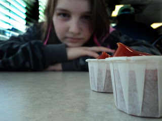
Ketchup
M Kimbell

Farm Girl
C Reeves
The photograph is taken at veterans park, it is my favorite because I like the color scheme and it was my best pinhole photo. The edits I performed were selecting a color range and using the selection to apply a gradient.
GOOD v.s. EVIL
C Douglass
I took this picture for our profile project. I did not change very much, except i bumped up the saturation a bit to make her red hair really pop. :)
Row Tahd
M Hines
This is a collage of Alabama things. I am a big Alabama fan. I got these images of Google. I used Photoshop. I put the images into a triangle and rotated copies of it.
Miami Attractions
C Ryan
This photo is my favorite because it was my first time using Photoshop. I had to crop photos from the internet and incorporate them into my photo. I had to use a lot of tools to crop out the people and put them in the pool. I used Photoshop and used these tools: magic wand tool, rectangular marquee tool, eraser, and the polygon lasso tool.
March 21, 2011
2012
B Gray
This is what I picture the world if it did ever encounter alien life. You can notice the Palin family and in the background dark clouds and to the left a space ship and the moon looks larger than usual. I used photoshop to enhance this photo. I used layer masks to make this photo look as thought it wasn't photoshopped. But considering it is a science fiction type of picture, people will assume it has been photoshopped.
Subscribe to:
Comments (Atom)


